
ICCIT Council’s Design Dash
About this work
My good friend Kaithlyn Chua has been meaning for us to do a designathon for a while. When one came up, our schedules didn’t allow us to participate, but then the ICCIT Council Design Dash rolled around. Kaithlyn asked if I was down for it, I said “yes,” and then she, Nwabuife Amede — another good friend of mine — and I registered for the design dash.
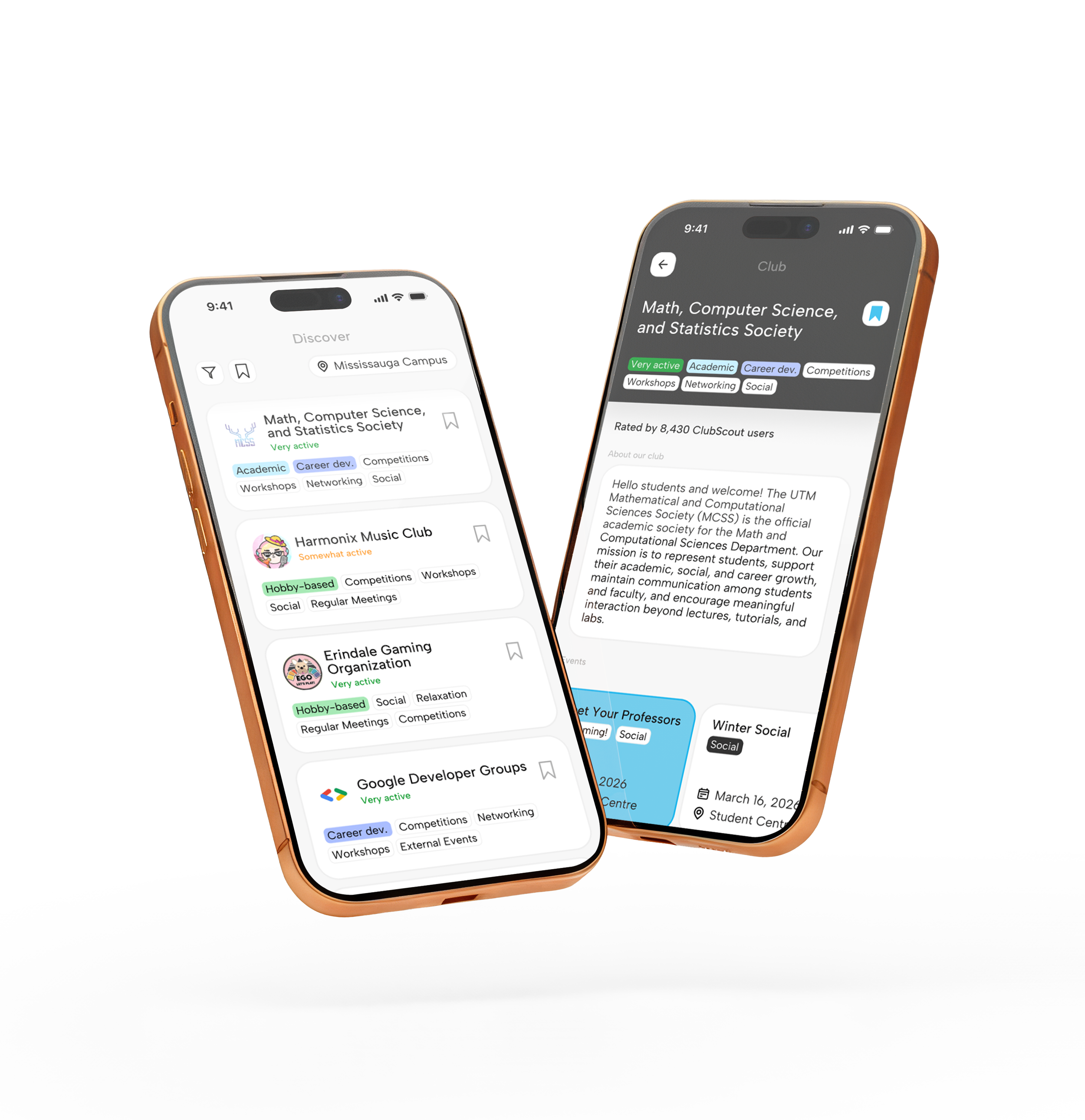
The prompt was to design an app that solves a problem that first years face. Together we came up with ClubScout, a mobile app like RateMyProf but for student clubs across the UofT tri-campus.
We had four hours total and went head to head with six other teams. Our team — a.k.a., UTM’s Finest Designest — ended up coming in first place! Shoutout to my awesome team members Kaithlyn and Nwabuife!
You can take a look at our prototype here if you’re interested!
Process
Our team cycled through a couple of ideas. Perhaps a finances manager app for the TCard? No, finance manager apps are overdone (looking at you, Dribbble) and it’s not a huge issue for students. Perhaps an app where students can crowd-rate courses at UTM since r/UTMississauga is 90% “should I take X course or X course?” and “what are some 400-level bird courses”?
We turned to Reddit to see what the people were saying and we saw that many people were looking for clubs to go to. We asked some first years about their experience with clubs and saw that they too had issues finding clubs to join and rarely looked at the posters hanging around UTM’s academic buildings. Thus, ClubScout was born — an app where the student population of UofT could select their interests and see related clubs, and also see what other students thought of them.
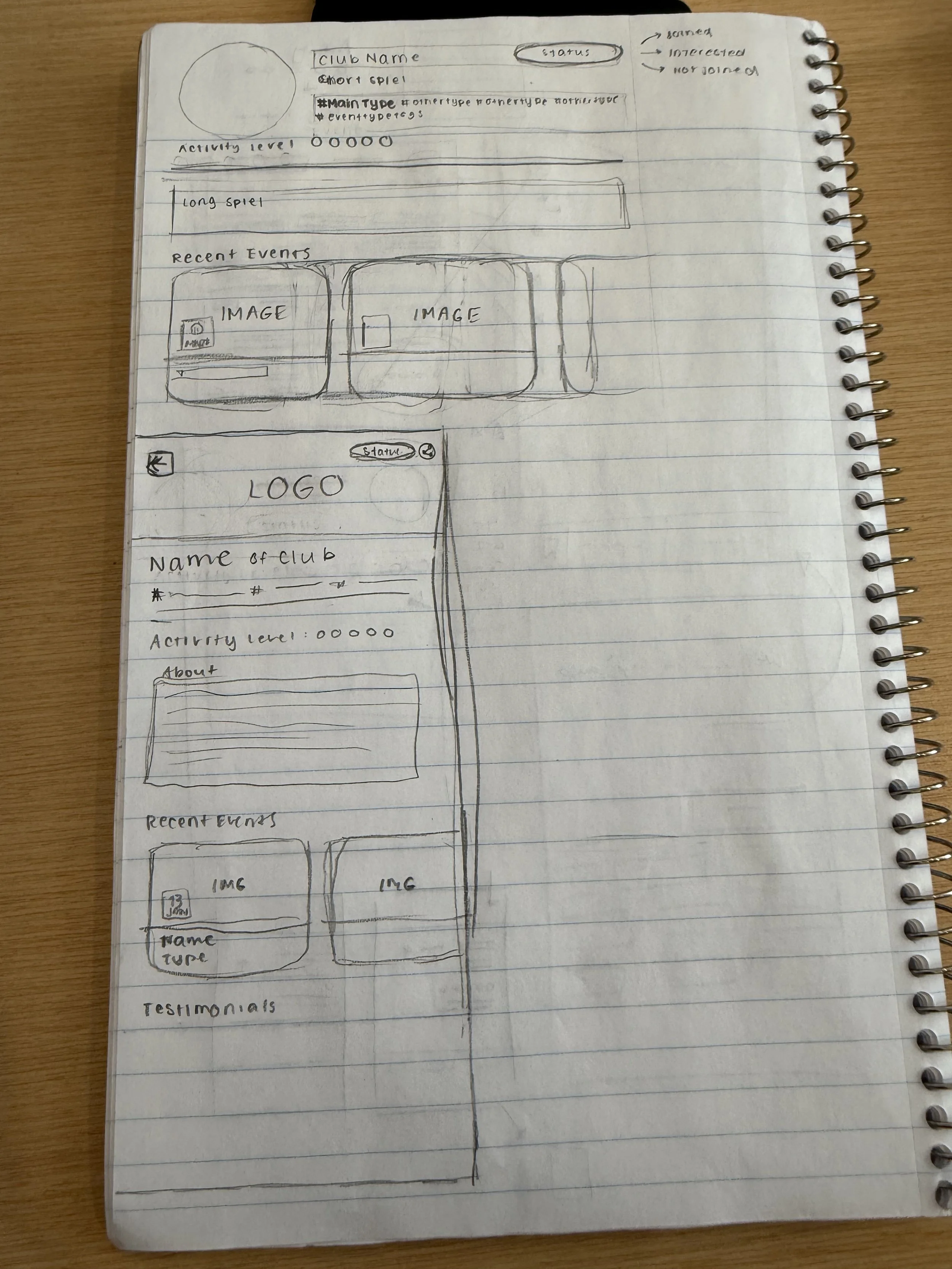
After all three of us were done with research, Kaithlyn and I did some quick wireframing (hers is on the left). I used my wireframe to plan out user flows, and then I immediately put it to design. While I did this, Kaithlyn and Nwabuife worked on our project brief and presentation.
During prototyping, I borrowed the fresh eyes of our lovely beta testers: my friends Camila Rodriguez, Leema Abbas, and Zia Lopez. I asked them things like, “Is this text too small? How’s the contrast on the tags?” And gave them standard user testing think-aloud tasks to complete to ensure the flows were A-OK.
One thing that slowed us down was the fact that Kaithlyn and I were very much web- and desktop-first designers. Design for the web and for mobile don’t overlap much. The sizes of the screens allow for a vastly different amounts of information, to where if you try to pack a desktop’s worth of info into a 6.1” screen, you run into difficulty. While she and I know this intuitively, it’s a bit hard to put into practice, and so even after we sketched things out and wireframed, we had to make revisions to ensure that the mobile app didn’t suffer from information overload.
Overall, I had a great experience. And we won, which made it even greater!
Type
Design
Tools
Figma