
VISION: Journey
READ THE FULL MAGAZINE HERE!About this work
About
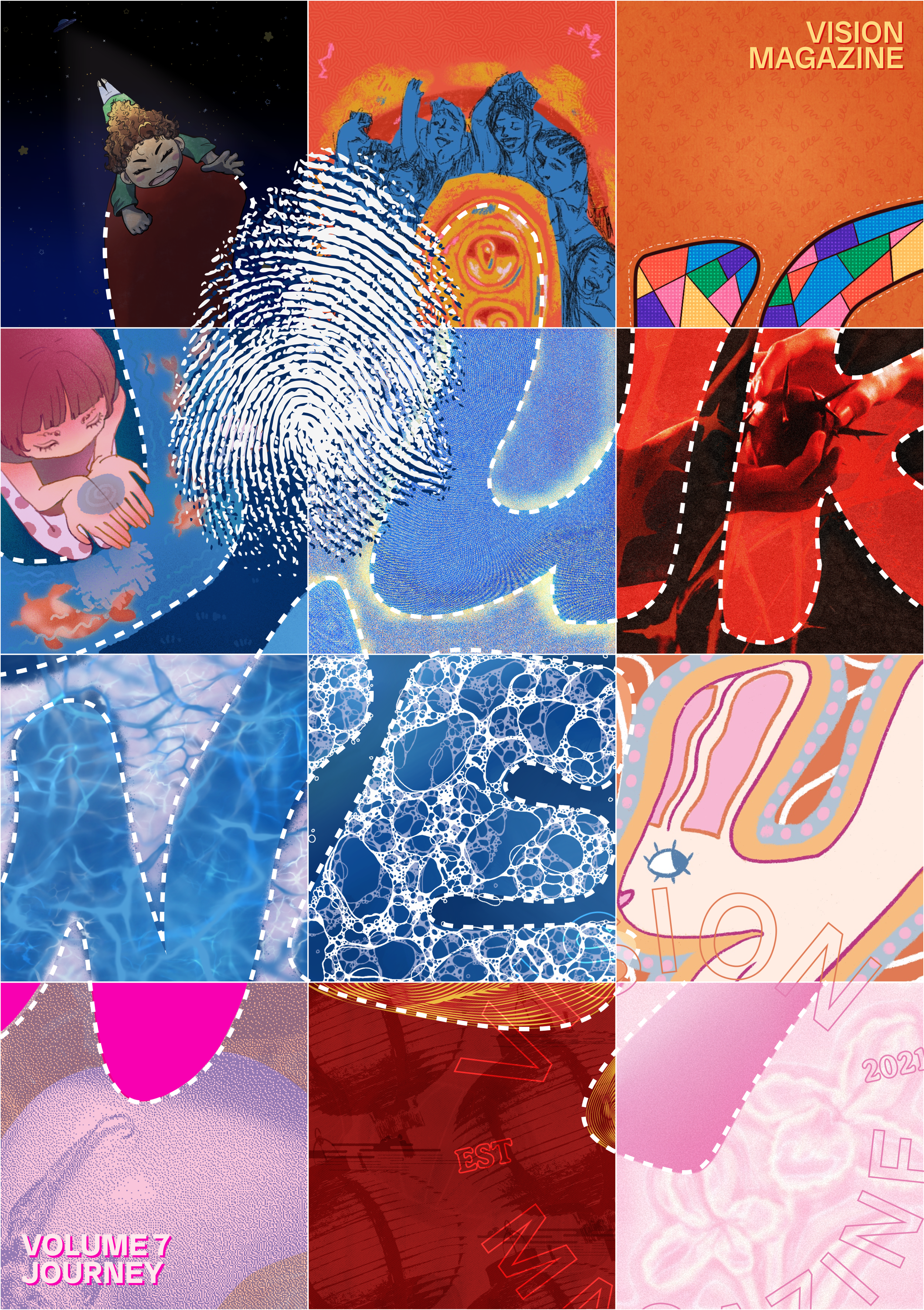
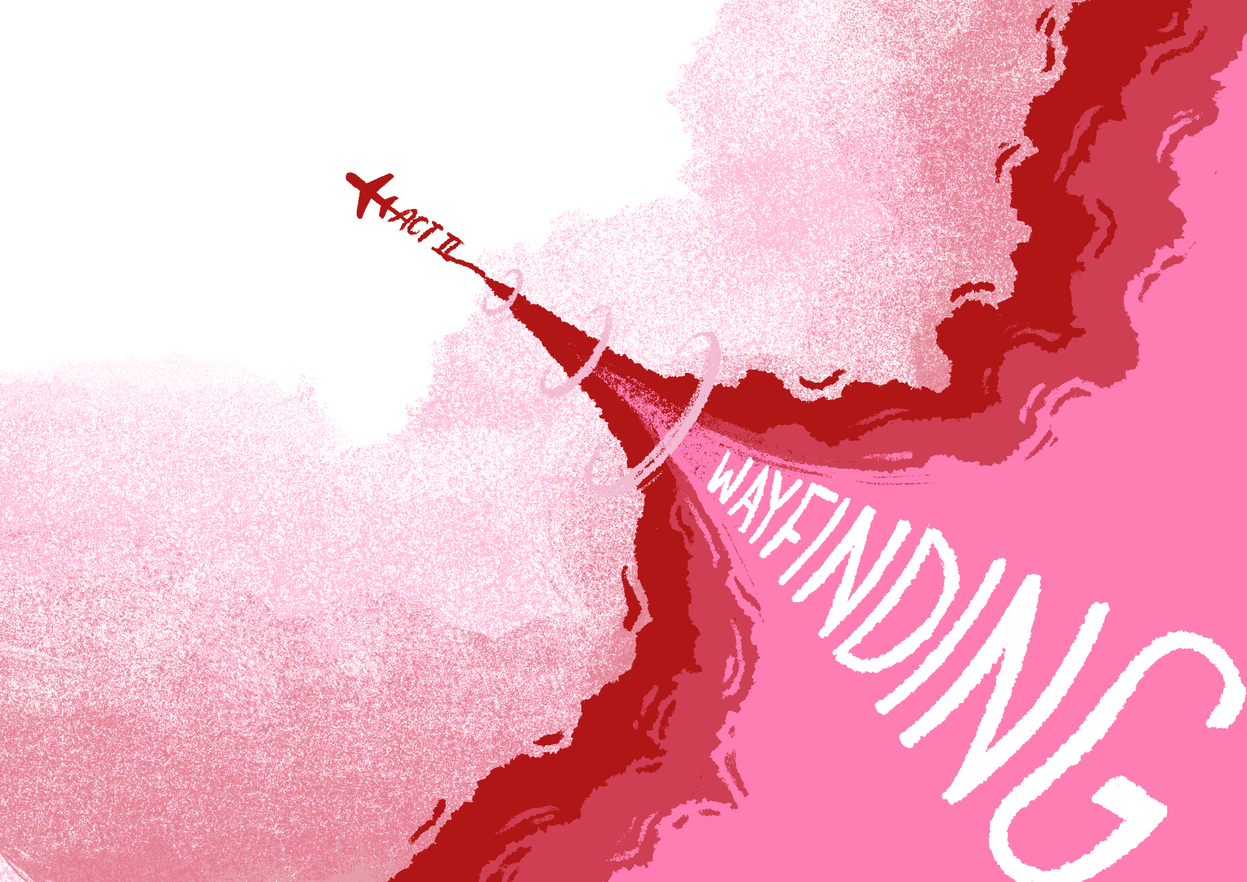
The magazine you see on the left was put together by my team of 12 unbelievably talented artists and graphic designers. A massive thanks to Naomi Chan, Iris Cioban, Juna Abutaha, Farah Baseet, Sameeha Fatima, Michaëlle Knights, Jules Lee, Crystal Lo, Ollie Paredes, Shanna Wong, Skylar Zhang, and Aria Zheng.
Another huge shout-out to all the executives: Mariana Ramirez-Zablah, Camila Rodriguez, Kaithlyn Chua, Leema Abbas, Jacqueline Vazquez-Doniz, Mayukha Pelluri, Ishanvi Tandon, and Martin Stric!
VISION is a student magazine put out by the Institute of Communication, Culture, Information and Technology (ICCIT) Council student club. I was first recruited for it in 2024 and then recruited again in the summer of 2025 to be the Art Director!
You can also read it on the VISION website which I designed alongside the talented Martin Stric!
Reflections
There’s a lot I am proud of and a lot I could have done better. This was my first time ever in any real design leadership role, and it meant a lot of my decisions were guesswork. The silver lining: I now have a personal catalog of bad decisions to draw from, which should help me make better decisions (and better mistakes) next time.
It was hard work to balance my social, academic, religious, and personal life with VISION, and I think there were times where I was so unfocused that VISION took a hit in quality. There were also times where I was so locked in on VISION that my grades dipped because I was working around the clock — at home, in class, between classes, during meetings, and so on. By the time the exhibition was done I was wondering what on earth I would do with myself.
That being said, VISION taught me that I’m very me-me-me when it comes to my obligations. This meant that I was afraid of interacting with my designers and, when things became overwhelming, my superiors as well. It taught me that I need to learn to ask for help and learn to be more of a team player at all times, including when I’m the leader of the team.
Process
Theme
The previous volume, Hello World, compared and contrasted humanity and technology, and sort of discussed the intersection of that. While it was a lovely theme, it was a bit restrictive for the contributors and for us me as a designer. In the inaugural VISION 7 meeting, we tried to come up with a new theme; specifically a theme that was broad enough to encompass many different stories and artworks. We spent hours just talking about what we wanted this volume to be — life, humanity or humanness, change, journeys — and specifically, non-linear, journeys-in-progress. Journey stuck because it was broad, it was all-encompassing, and, most importantly, it didn't focus on the resolution (or perhaps, the destination).
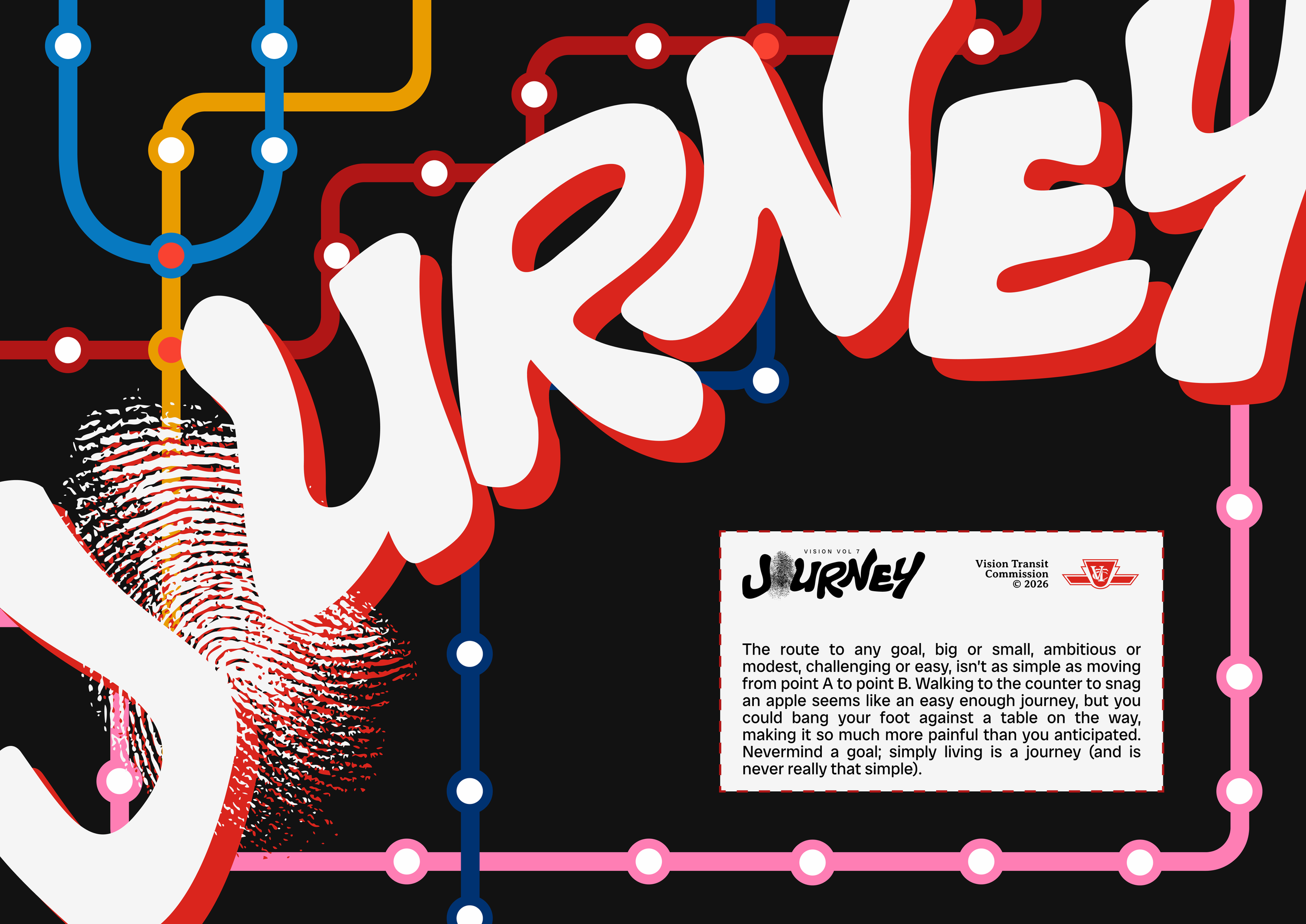
The logo came first. I had a layover at the Charlotte airport when I conceptualised it — it was only a few hours, which was not enough to make a brand guide, but I knew that posts would have to go out soon. So I started racking my brain for a logo. Our then-Marketing Director, Zoya Rizvi suggested to me that I make the ‘O’ in Journey into a fingerprint, which I ran with. I originally wanted to use a handwriting-style typeface for the logo, but I decided to draw it using the trusty vector tool in Figma instead.
Design direction
When I started thinking of design directions to pass onto my future designers, I had three realisations: The first was that I had never actually held a design leadership role before. On VISION 6 I answered to the Co-creative Leads, who answered to the Council co-presidents. But VISION 7’s executive restructuring gave me a Directorial role, and my superiors had told me straight-up that as along as I could defend my decisions, what I said went.
The second thing was that the reason we named this volume something as broad as Journey was to allow authors and featured artists to have some freedom with their subject matters. I thought it would be cool to extend this courtesy to my designers and have each page look visually different.
The third thing was that Mariana’s vision for VISION was that we would be an incubator for budding designers. It was something to hone skills on and to learn from, and realistically something to add to the portfolio.
All three of these realisations made me lean towards being laissez-faire with the design. The only place where I was strict was with regard to colour and typefaces. I made a brand guide with approved colours, logos, and font families. The colours were mostly warm tones to foil volume 6’s blues and greens and then asked my designers and artists to kind-of-sort-of adhere to the tones so that we’d have colour cohesion.
The magazine was made mostly in Adobe InDesign and took the better part of our Winter semester. Whereas I thought I’d be doing a lot of design, I found myself doing quite a bit of admin — specifically, collecting designs from my designers and art from my artists, assisting the Writing & Editing Director with ordering submissions, light editing, and page layouts.
It was a lot of far from easy and far from smooth — especially since this was my first time doing anything like this — but it was also a ton of fun. It would have been a lot more work without the help of Mariana Ramirez-Zablah, our Executive Creative Director; Camila Rodriguez, the Creative Operations Director; and Mayukha Pelluri, our Writing & Editing Director. Thanks guys!
Type
Art and Design
Tools
Indesign, Photoshop
Client
VISION Magazine
Year
2026