
UTM Dining Redesign
About this work
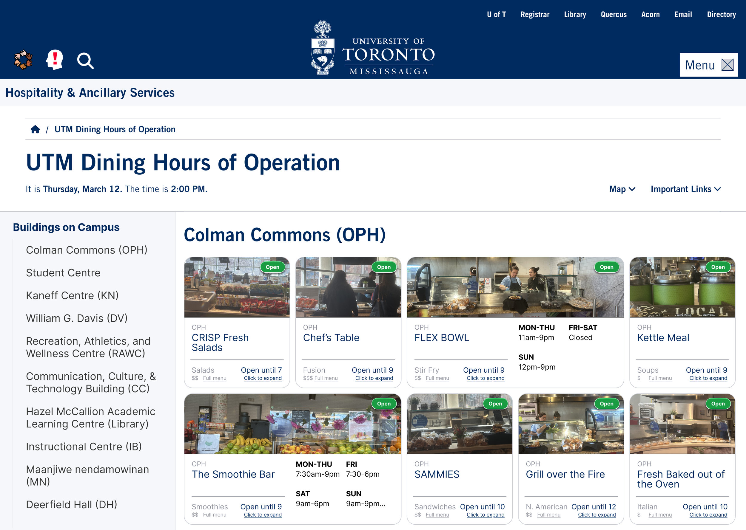
When you take CCT305 (“Design and Implementation of Multimedia Documents”), you spend four months working on one app/website design in a team of four or more. As any honest University of Toronto Mississauga student will tell you, the old Hours of Operation site was tragic. As such, my friends — Andie de Castro, Kaithlyn Chua, Mayukha Pelluri, and Brianna Zhao — and I decided to use our four months to redesign it.
Process
Defining and solving the problem
We started with empathy maps, personas, SWOT analyses, and most importantly, conducted preliminary interviews with first year students at UTM. Kaithlyn spearheaded this and we learned that the number one issue that students had with the page was that it was just too long and cluttered. In winter of 2026, the site was long and full of dropdowns that led to confusing tables that many students just found unwieldy.
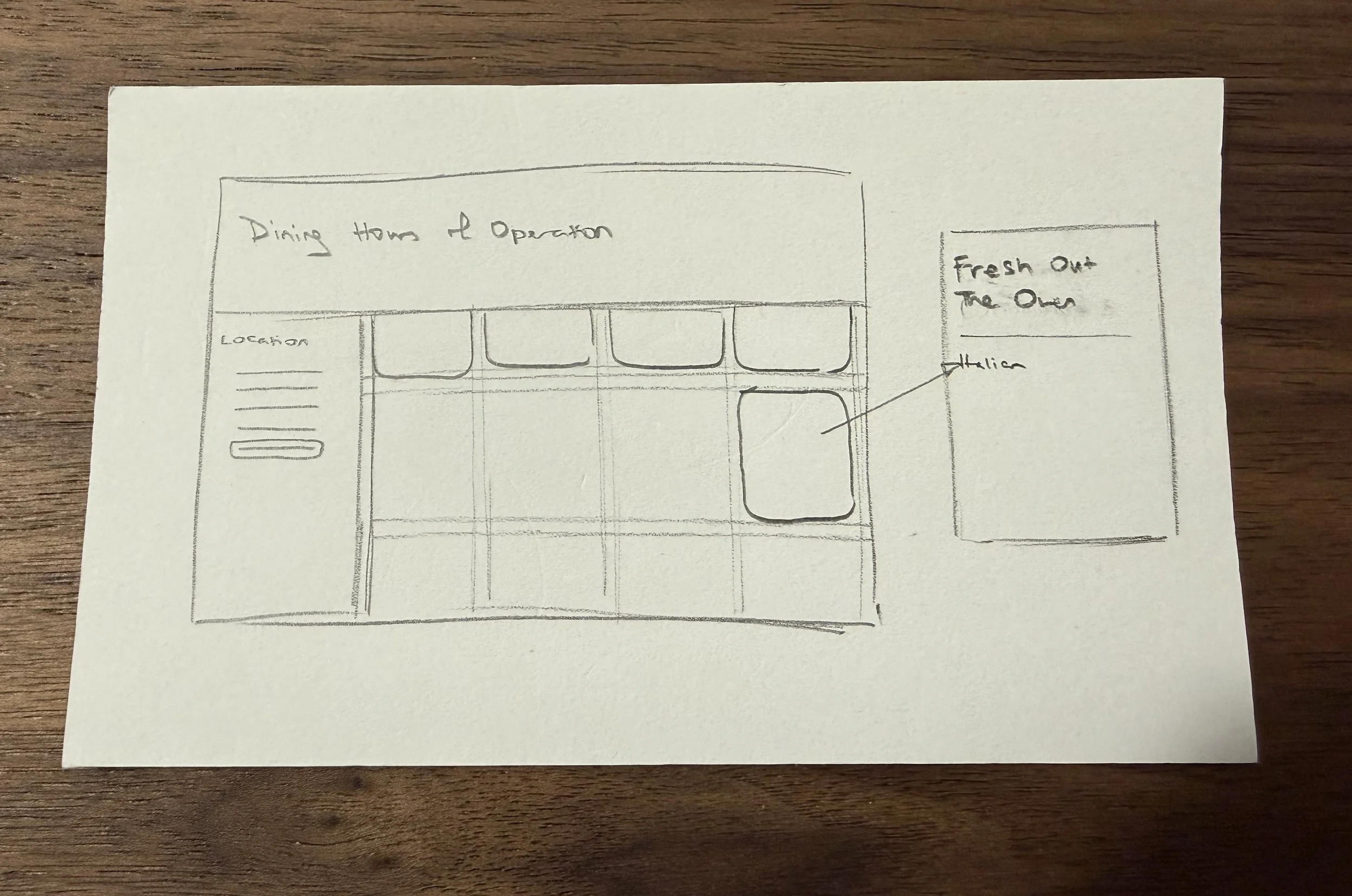
So, we started ideating and decided that a grid of cards would be best for compactness. Later on, we decided it’d be even better if people could decide to click on them to expand. These would all be sorted by building, traversable using a handy sidebar with which one could jump to the building they’re in.
Each card would say the name of the restaurant, whether it was open at the time of viewing, and some information about hours for people planning ahead.
Implementation and user testing
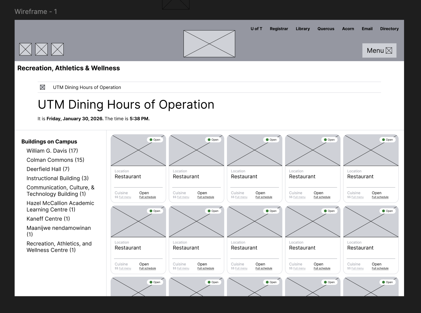
I was chosen to make the original wireframe because of my Figma finesse. The most difficult part was making the sidebar, because it quickly became apparent that using variables for it would be cumbersome—I had to make a brand new component for every highlighted building name (check it out on page 2 of the Figma file).
The main grid itself was supposed to be a 1100px-long frame with card components inside. It was hard at first to conceptualise a way of making anchor points in Figma, but then I decided to break it down into one sub-frame per building, with one line above each frame that acted as the anchor point. Each sidebar button brought the line to the top of the visible frame, which was both functional and left a good amount of padding for the content.
A series of think-aloud user tests afterwards revealed a couple of other oversights and tweaks. For example, people found the “Open” indicators too small and lacking contrast. Though we had sorted the sidebar based on number of restaurants, some people wanted it to go counter-clockwise through the campus on a map, sort of following a mental map of the campus. Some people wanted a map included.
Some of the cards also proved to be difficult to read following the F-model that our eyes take when we read. There were so many changes to be made, which really opened my eyes — as far as I was concerned, this was a flawless and totally intuitive system, but users had found issues with it.
Final touches and designs
After I finished making changes, I took a trip to UofT’s brand guide page and added the branding. As a team, we also roamed around campus averaging prices of menu items, guesstimating the cuisines, and taking photos of the storefronts to plug into the final prototype.
You can view the finished prototype here.
Type
UI Design
Tools
Figma
Client
CCT305
Year
2026
More
Finished prototype